

今回は『ビーチに向かう子供達』をテーマにイラストを描きました。
マイアミビーチに行った際に、ビーチに向かう橋の雰囲気が、ちょうど子供の頃海に行った時の雰囲気を思い出しました。
マイアミの気候と沖縄は少し似ていて、どこか懐かしさを感じたのかもしれません。
まずは小さくラフを描きます。今回は海に向かう楽しい感じを描きたいと決めました。
This time I painted illustration about "Children toward to sea".
I went to Miami beach and There had a bridge going to sea. That landscape reminded my local town .
Miami and Okinawa have similar some atmosphere . So I may have felt nostalgia.
At first I made a small rough sketch .I wanted to drawing of Children having fun to go to beach .

次に大まかな線画を描きました。
この後Procreateで描いていくのですが、まだ線画はアナログの方が描きやすい感じがあるので、アナログで描いてスキャンしました。
Next step is I draw with ink on Watercolor paper.
I still use to ink with line drawing.because still comfortable more than digital line drawing.
and I did scan after.
次に大まかな色をここで決めておきます。ラフの時点で色を決める大事さを最近身にしみて感じています。そうしないとゴールがなく、長いこと色探しに迷ってしまうからです。
また、今回はテーマも決まっていたので、色選びもすごくスムーズにいきました。
以前はいいなと感じた場所や写真に、自分の感じた雰囲気を寄せて行くという描き方が多かったのですが、最近は自分がどう感じたかやこう描きたいというのを軸に、材料を集めるというやり方の方がとても描きやすいし、満足感が違うことを発見したので、そのやり方を取っています。
Next step is I made colour rough sketch.These days I thinking that When I make illustration , important is decide colour at first step.If I do not this step, I lose my end. And I look for colour so long time.
But This time I already decide what I want to make definitely , So I chosen colour easier.
Before when I make illustration , I get closer to reference photo what I feel . But now, I think first is What I want to draw , what I feel, then I gather reference photo .It's because satisfaction is very well.

一通り描いて見ます。子供たちが線画ではゆっくりと歩いている感じだったので、もう少し駆けているようにしました。全体的に色のバランスが気になったので、Photoshopの白黒で色のバランスを見ていきます。
I began to draw. Children was slow walk in the first rough sketch.
So I redraw like running a little. And I was wondering overall colouring. So I checking colouring on Photoshop .

葉っぱの部分が暗い色が手前に来ているのでこれは直さなくてはいけません。
また、地面がもう少し明るくしたいと思ったので、こちらも直していきます。
もう少しパキっとした元気な感じを出したいなと思いました。
This picture is I moved on photoshop 'Black and White'
Leaves parts are dark colour in the front , so I have to redraw.
And I wanted to more brighten of ground. and I wanted try to more strong contrast.

地面を明るくして、葉っぱも彩度の高い色を手前に持ってきました。また、赤系の葉っぱも追加してみました。
子供達の位置も画面の正面に、また影もつけました。
でも葉っぱの色が気になるのでprocreateの明るさ、色相調整で色を変えて見ます。
葉っぱの部分をもっと明るくしたいなぁと思いました。
I redraw ground bright. And I bring bright colour of leaves in front.Also I added red leaves .
And I changed arrangement of children to more middle of screen. And add shadow.
I still wondering colour of leaves . So I did change Brightness/Contrast and Hue/saturation on the Procreate.
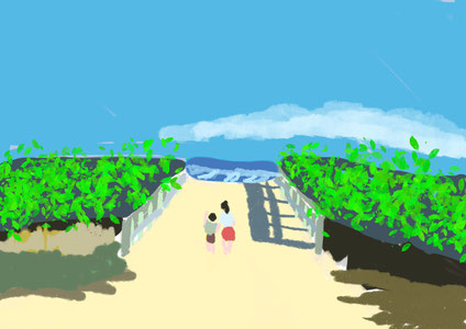
葉っぱが黄色になりました。もっと映えた感じがしたので気に入っています。
ここでPhotoshopに切り替えて、最後の調整をします。
I did change leaves colours of yellow. It's more good balance I think . I like this parts.
And final step is I switched over to Photoshop and checking illustration.

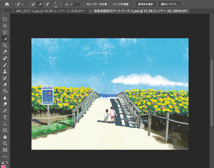
完成しました。でも目がおかしいかもしれないので、明日またみてみます。
It's done. But I thought maybe my eye couldn't find some mistake. So I checked again next day.

これが最後のイラストです。色々な箇所を追加しました。やっぱり最後のチェックはとても大事です。
ご覧いただきありがとうございました!
This is the final illustration.I add a lot of detail. So final check is important I thought.
Thank you for watching my process!!